|
|
||
|---|---|---|
| .. | ||
| solution | ||
| README.md | ||
| desired-outcome.png | ||
| index.html | ||
| style.css | ||
README.md
Margin and Padding #2
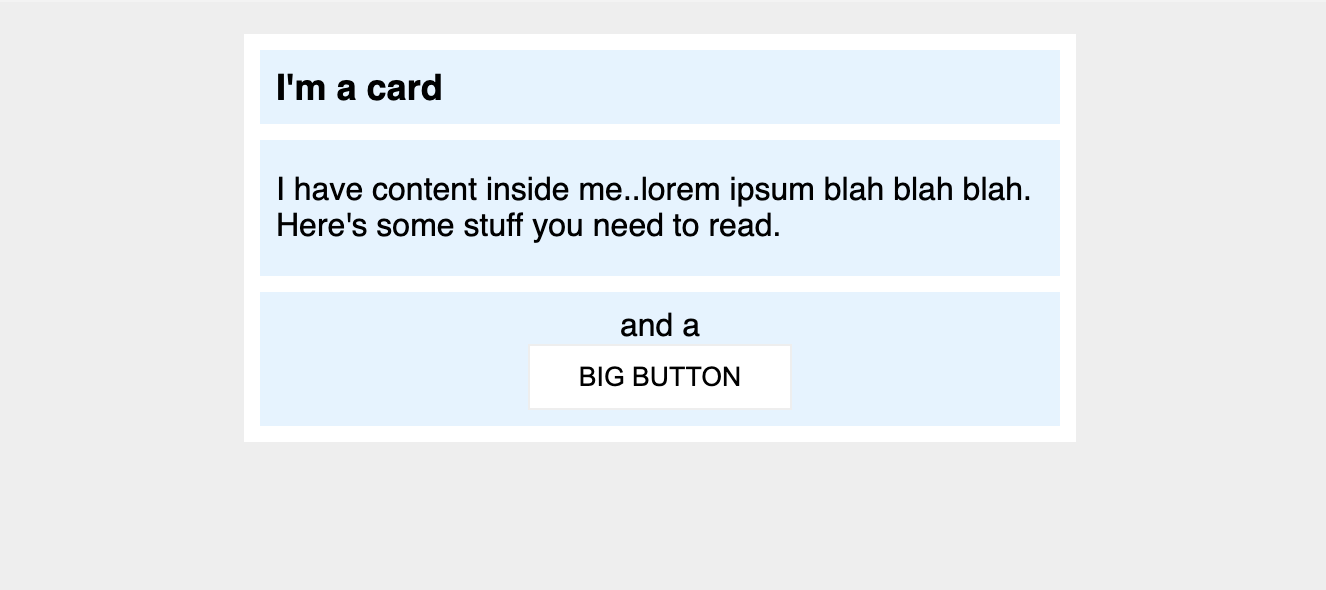
This one is a little nicer looking, and a little closer to something you might see in the real world. You'll need to change a little more than just margin and padding to make it look exactly right.
Desired outcome
Self Check
Use this section to check your work. On these projects, your goal isn't to attain 100% pixel perfection, but to use the tools you've learned to get relatively close to the desired output.
- There is 8px between the edge of the card and its content (the blue sections).
- There is an 8px gap between each of the blue sections inside the card.
- The title of the card uses a 16px font.
- There are 8px between the title text and the edge of the title section.
- The content section has 16px space on the top and bottom, and 8px on either side.
- Everything inside the
.buttonsection is centered, and there is 8px padding. - The Big Button is centered on its own line.
- The Big Button has 24px space on the sides, and 8px on top and bottom.
