Remove a step of abstraction about cards "knowing" so the hint directly references defining space of cards. Co-authored-by: Eric Olkowski <70952936+thatblindgeye@users.noreply.github.com> |
||
|---|---|---|
| .. | ||
| solution | ||
| README.md | ||
| desired-outcome-smaller.png | ||
| desired-outcome.png | ||
| index.html | ||
| style.css | ||
README.md
The Holy Grail of Layout
In this last flexbox exercise you're going to recreate an incredibly common website layout. It is so common that it is often called the Holy Grail layout... and with flexbox it is actually pretty easy to pull off.
As with the previous exercise, we've left a little more for you to do.
Hints
- You will need to change the flex-direction to push the footer down.
- You will need to add some divs as containers to get things to line up correctly.
flex-wrapwill help get the cards aligned correctly.- Make sure you define how much space the cards should take up, in order for
flex-wrapto work as intended.
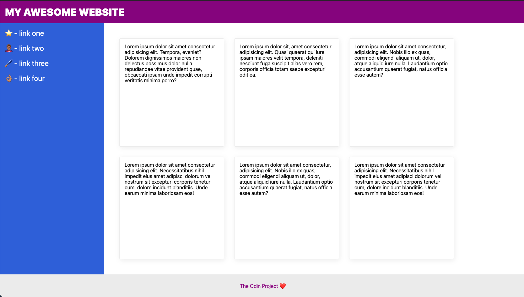
Desired outcome
The number of cards lined up in that section will change based on the width of your screen, so don't stress about getting exactly a 2x3 or 3x2 grid.
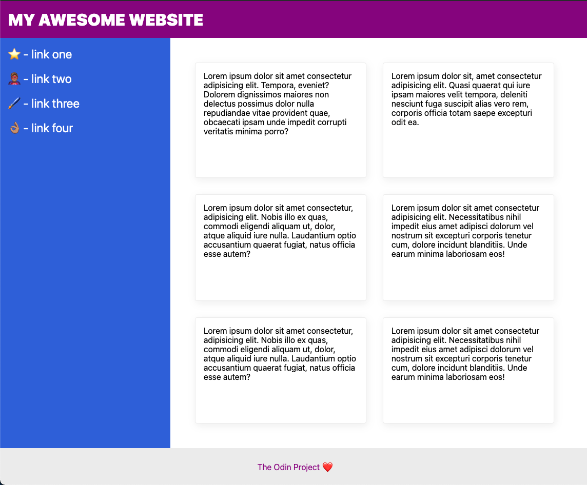
On a smaller screen it will look like this:
Self Check
- The header text is size 32px and weight 900.
- The header text is vertically centered and 16px from the edge of the screen.
- The footer is pushed to the bottom of the screen (the footer may go below the bottom of the screen if the content of the 'cards' section overflows and/or if your screen is shorter).
- The footer text is centered horizontally and vertically.
- The sidebar and cards take up all available space above the footer.
- The sidebar is 300px wide (and it doesn't shrink).
- The sidebar links are size 24px, are white, and do not have the underline text decoration.
- The sidebar has 16px padding.
- There is 32px padding around the 'cards' section.
- The cards are arranged horizontally, but wrap to multiple lines when they run out of room on the page.

